写在前面的重要提醒
编程世界确实有很多"行话",听起来吓人,但其实大部分概念都可以用日常生活中的东西来类比。
如果你在读这本书的过程中遇到不理解的词,不要慌——这一章就是为你准备的。
更重要的是:你不需要记住所有词。你只需要知道:遇到不懂的词,怎么问 AI,它就能用你能听懂的话解释给你。
B.1 用一句提示词,让 AI 变成你的私人翻译官
在你继续往下读之前,先把这句话记住:
我是一个完全零编程基础的人。请用日常生活中的东西做类比,用小学生都能听懂的语言,解释一下什么是[你想了解的词]。
不要用任何专业术语。如果一定要用,请先解释那个术语。
比如,你问 AI:
"我是一个完全零编程基础的人。请用日常生活中的东西做类比,用小学生都能听懂的语言,解释一下什么是数据库。
不要用任何专业术语。"
AI 会告诉你:
数据库就像一个超级大的 Excel 表格,但是比 Excel 厉害得多。
它可以同时让很多人查看和修改数据,而且不会搞混。
就像图书馆的书架——每本书(每条数据)都有固定的位置,想找什么一下子就找到了。
你看,这样就懂了。
所以,学完这一章,你最大的收获不是记住这些词,而是学会用这一句提示词,随时让 AI 帮你解释任何你不懂的词。
B.2 你在本书中可能遇到的专业词汇
下面把你在书中可能遇到的词,用最通俗的方式解释一遍。每个词都配了"更进一步"——如果你想深入了解,可以直接复制那段提示词发给 AI。
项目是怎么构成的?
前端
类比:餐厅的服务员。
解释:你手机上看到的页面、按钮、颜色、动画,这些都是前端。它负责"看起来什么样"和"你点什么"。
更进一步:
"我是一个零基础的初学者,请用餐厅做类比,给我讲一下前端开发到底做什么。然后告诉我,如果我想学前端,应该从什么开始。"
后端
类比:餐厅的厨房。
解释:你点了菜(点了按钮),服务员把需求传到厨房,厨房做菜(处理数据),再把菜端出来。你看不到厨房,但菜是从那里出来的。
更进一步:
"我是一个零基础的初学者,请用餐厅做类比,给我讲一下后端开发到底做什么。前端和后端是怎么配合的?"
数据库
类比:餐厅的仓库 + 菜单本。
解释:餐厅有什么食材、每道菜多少钱、今天的订单记录,这些"数据"都存在数据库里。它就像一个超级大的、有规则的表格。
更进一步:
"我是一个零基础的初学者,请用最通俗的方式给我讲一下数据库是做什么的。
然后告诉我:如果我只是想用 AI 帮我做一个 App,我需要学数据库吗?
"
服务器
类比:餐厅的位置。
解释:你的 App 或网站不是飘在空中的,它是"放在"一台电脑上的。这台电脑24小时开机,等着你访问。这台电脑就叫服务器。
更进一步:
"我是一个零基础的初学者,请用最通俗的方式给我讲一下服务器是什么。我的App在我自己电脑上能跑,为什么还需要服务器?"
部署 / 上线
类比:餐厅开业。
解释:你在厨房试做了很多菜(你自己电脑上开发好了),现在要把菜单挂出去、打开大门、让真正的客人进来吃(让真实用户能用)。这个过程叫部署,也叫上线。
更进一步:
"我是一个完全零基础的人,AI帮我做好了一个网站。
请用最通俗的语言告诉我:怎么把它部署上线,让全世界的人都能访问?
一步一步说。"
代码是什么做的?
代码
类比:菜谱。
解释:代码就是给电脑看的菜谱——告诉电脑一步一步做什么。只不过不是"加盐少许",而是非常精确的指令。
更进一步:
"我是一个完全零基础的人,请用生活中做菜的例子,给我讲一下代码到底是什么。为什么同样是菜谱,有的写得好,有的写得差?"
函数
类比:菜谱里的"蛋液做法"小卡片。
解释:蛋液的做法可能很多菜都要用到——炒蛋、蛋花汤、蛋糕。与其每次都写一遍,不如把它写成一张小卡片,每次要用的时候说"按卡片A做蛋液"。函数就是把一段常用的操作打包成一个"小卡片",随用随取。
更进一步:
"我是一个零基础的人,请用生活中做菜的例子,给我讲一下编程里的函数是什么。用最简单的方式说明它的好处。"
变量
类比:标签。
解释:你在瓶子上贴个标签写"盐",在另一个瓶子上贴个标签写"糖"。这样不用每次都打开闻一闻,看标签就行。变量就是存储信息的标签,给它取个有意义的名字,以后要用的时候直接叫名字。
更进一步:
"我是一个零基础的人,请用日常生活中的例子解释编程里的变量是什么。为什么给变量取好名字很重要?"
组件
类比:乐高积木。
解释:你不会每次都重新造一个轮子——按钮做好了,就是一个乐高块。下次要用按钮,直接把这个块拿过来拼上就行。组件就是可重复使用的UI积木。
更进一步:
"我是一个零基础的人,请用乐高积木的类比给我讲一下编程里的组件是什么。为什么要把代码拆成组件?"
框架
类比:连锁餐厅的标准操作手册。
解释:开一家麦当劳,你不用从零设计厨房、柜台、菜单。总部给你一本手册,告诉你所有标准流程。框架就是这种"标准操作手册",让你不用从零开始搭一切。
更进一步:
"我是一个零基础的人,请用连锁餐厅的类比给我讲一下编程里的框架是什么。为什么有人用不同的框架?我需要学吗?"
目录 / 文件夹
类比:你电脑上的文件夹。
解释:就像你把照片放"照片"文件夹、文档放"文档"文件夹一样,代码也按功能分类存放。你经常会听到"src 目录"——src 是 source(源码)的缩写,就是放代码的地方。
更进一步:
"我是一个零基础的人,请给我解释一下编程项目中的目录结构是什么。为什么代码要分文件夹放?src 目录里一般有什么?"
配置文件
类比:餐厅的"营业须知"——今天几点开门、菜单价格调多少、开不开空调。
解释:配置文件不是代码本身,而是告诉程序"该用什么参数运行"。比如数据库地址、端口号、密码这些信息,都写在配置文件里。改配置文件不需要改代码。
更进一步:
"我是一个零基础的人,请用餐厅营业须知的类比给我解释什么是配置文件。为什么要把配置和代码分开?"
模块
类比:餐厅里的不同部门——厨房、吧台、收银台。
解释:一个大项目太复杂,就把代码按功能拆成"模块"。登录是一个模块,支付是一个模块,评论是一个模块。每个模块管好自己的事,互不干扰。
更进一步:
"我是一个零基础的人,请用餐厅部门的类比给我讲一下编程里的模块是什么。模块和组件有什么区别?"
依赖
类比:做菜需要的食材供应商。
解释:你的项目用到了别人写好的代码(比如一个图表库),这个图表库就是你的"依赖"。就像你做汉堡需要面包供应商供货——面包供应商是你的"依赖"。依赖需要安装和管理,有时候版本不对就会出问题。
更进一步:
"我是一个零基础的人,请用食材供应商的类比给我解释什么是项目依赖。为什么依赖版本不对会出问题?"
第三方库
类比:现成的调料包。
解释:你不需要自己从零调酱汁——超市有现成的。第三方库就是别人写好的、打包好的代码工具,你直接拿来用就行。比如图表库、日期处理库。它和"依赖"是同一个意思的不同说法。
更进一步:
"我是一个零基础的人,请用调料包的类比给我解释什么是第三方库。我怎么知道该用哪个库?"
代码出了问题怎么办?
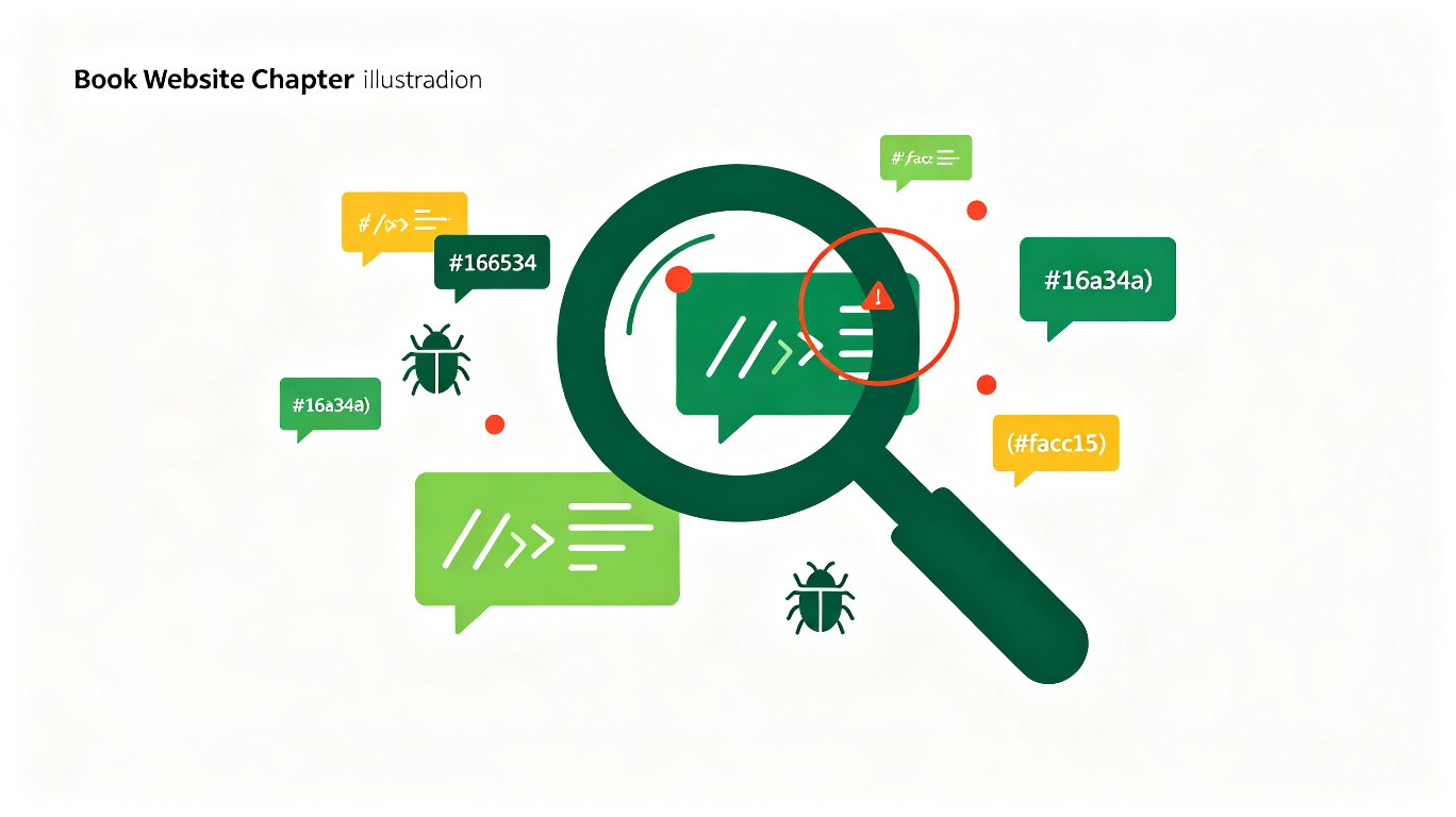
Bug
类比:菜里有虫子。
解释:程序不像预期那样工作,就是有 Bug。可能是一个小显示错误,也可能让整个程序崩溃。"Bug"这个词在 19 世纪就被工程师用来形容机器故障了。1947 年,计算机科学家 Grace Hopper 在哈佛 Mark II 计算机的继电器里发现了一只真正的飞蛾,导致机器出故障。她在日志本上贴了这只飞蛾,写下"第一个被发现的 bug"。这件事让"Bug"一词在计算机领域流行开来。
更进一步:
"我是一个零基础的人,请给我讲一下编程里的 Bug 是什么。为什么叫 Bug?常见的 Bug 有哪几种?"
重构
类比:厨房重新装修,但菜单不变。
解释:功能还是那些功能,但代码内部重新整理——把重复的代码合并、把太长的函数拆短、把混乱的命名改清楚。就像厨房装修不影响菜单上的菜,但做菜效率更高了。重构不改功能,只改代码质量。
更进一步:
"我是一个零基础的人,请用厨房装修的类比给我解释什么是代码重构。重构和重写有什么区别?"
边界条件 / 边界情况
类比:一道菜要 1-5 份辣度,那 0 份辣和 6 份辣怎么办?
解释:程序正常情况都测过了,但极端情况没测——输入是空的、数字是负数、用户一口气选了 999 件商品。这些"极端情况"就是边界条件。AI 经常忘记处理边界条件,需要你提醒。
更进一步:
"我是一个零基础的人,请用点餐的类比给我解释什么是边界条件。为什么 AI 容易忽略边界条件?"
异常处理
类比:厨房着了火的应急预案。
解释:程序运行时可能遇到意外——网络断了、数据不存在、用户输入了乱码。异常处理就是提前准备好"如果出错了怎么办"的方案,让程序不会直接崩溃,而是给出友好的提示。
更进一步:
"我是一个零基础的人,请用厨房应急预案的类比给我解释什么是异常处理。try-catch 是什么意思?"
项目怎么管理?
开发环境 / 生产环境
类比:餐厅的后厨 vs 前厅。
解释:开发环境是你在自己电脑上调试代码的地方(后厨试菜),生产环境是真正给用户使用的地方(前厅上菜)。两者的配置可能不同——开发环境用假数据没关系,生产环境用真数据不能出错。
更进一步:
"我是一个零基础的人,请用餐厅后厨和前厅的类比给我解释开发环境和生产环境的区别。为什么需要分开?"
回滚
类比:新菜不受欢迎,菜单换回旧版。
解释:你上线了新版本,发现有严重问题。回滚就是"退回上一个正常版本"——像撤销一样,但是在线上环境。这就是为什么每次上线前都要备份旧版本。
更进一步:
"我是一个零基础的人,请给我解释什么是回滚。为什么每次上线都要准备回滚方案?"
硬编码
类比:把价格直接刻在菜单牌上,改价格要重新做菜单牌。
解释:把具体数值(密码、地址、端口)直接写死在代码里,而不是放在配置文件中。一旦需要修改,就要改代码本身,很容易出错。正确做法是把这些值放在配置文件或环境变量里。
更进一步:
"我是一个零基础的人,请用菜单牌的类比给我解释什么是硬编码。为什么硬编码不好?"
技术栈
类比:厨房的工具套装。
解释:做不同菜系需要不同工具——中餐要炒锅,西餐要烤箱。同样,做不同项目用不同的技术组合:前端用什么、后端用什么、数据库用什么,这套组合就是"技术栈"。
更进一步:
"我是一个零基础的人,请用厨房工具套装的类比给我解释什么是技术栈。常见的 Web 技术栈有哪些?"
人和电脑怎么互动?
登录 / 注册
类比:进健身房刷卡。
解释:注册就是你第一次去健身房,填表办卡。登录就是下次来,刷卡进门。电脑通过这个知道"你是谁"。
更进一步:
"我是一个零基础的人,请给我讲一下网站登录和注册背后发生了什么。为什么需要密码?我的密码存在哪里?怎么保证安全?"
接口(API)
类比:餐厅里的服务员。
解释:你去餐厅,不是直接冲进厨房自己炒菜。你告诉服务员你要什么,服务员去厨房下单,再把菜端给你。这个服务员就是"接口"——你和厨房(后端)之间的传话人。
更进一步:
"我是一个零基础的人,请用餐厅服务员的类比给我讲一下 API(接口)是什么。为什么软件之间需要接口?"
状态
类比:你的心情。
解释:你现在是饿了、饱了、开心、还是困了——这叫你的"状态"。App也一样,登录了没、购物车里有几件东西、现在在第几页——这些都是"状态"。
更进一步:
"我是一个零基础的人,请用日常生活中的例子给我解释编程中的'状态'是什么意思。为什么管理状态很重要?"
缓存
类比:冰箱里的剩菜。
解释:每次饿了都出门买菜、洗菜、做菜,太慢了。如果昨天多做了一些放冰箱,今天热一热就能吃,快多了。缓存就是把常用的数据"暂存"起来,下次用的时候直接取,不用重新算。
更进一步:
"我是一个零基础的人,请用冰箱存菜的类比给我讲一下编程中的缓存是什么。它有什么好处,又有什么需要注意的?"
代码质量怎么保证?
测试
类比:做菜时尝一尝。
解释:你不会把一整桌菜做完才尝第一口。你会边做边尝——咸了加水,淡了加盐。测试就是"边做边尝"——不是最后才检查,而是一直在检查。
更进一步:
"我是一个零基础的人,请用做菜时尝味道的类比给我讲一下软件测试是什么。为什么测试很重要?AI能帮我测试吗?"
性能
类比:做菜的速度。
解释:同样的菜,有人30分钟做好,有人2小时。性能就是"你的App/网站跑得有多快"。如果用户点一个按钮要等5秒才有反应,就像等了2小时才吃到一盘拍黄瓜——体验太差了。
更进一步:
"我是一个零基础的人,请用做菜速度的类比给我解释软件的'性能'是什么意思。AI能帮我改善性能吗?"
安全
类比:家里的门锁。
解释:你不会让陌生人随便进你家。安全就是给App装上门锁——密码登录、权限控制、数据加密,防止坏人进来偷东西或搞破坏。
更进一步:
"我是一个零基础的人,请用家里门锁的类比给我解释网络安全是什么。如果我让AI帮我做了一个App,我需要担心安全问题吗?"
响应式/适配
类比:一件衣服在不同身材的人身上都能穿。
解释:你的网站在电脑上看很好,但手机上看字太小、按钮挤在一起。响应式设计就是让同一个页面在不同屏幕大小(手机、平板、电脑)上都能舒服地显示。
更进一步:
"我是一个零基础的人,请给我讲一下响应式设计是什么。如果我让AI帮我做网站,我需要专门告诉它做响应式吗?"
B.3 一些本书没出现但你可能会听到的词
以下是书中可能偶尔出现、或你继续用 AI 编程很可能会遇到的词。每个都配了"一键问 AI"的提示词。
编程语言(Python / JavaScript / 等)
"我是一个零基础的人。请给我讲一下什么是编程语言。
用人类语言的类比解释。然后给我列一个表格,说明 Python、JavaScript 等主流语言分别适合做什么。
告诉一个纯新手应该先学哪个。"
版本控制(Git)
"我是一个零基础的人。请用写作文打草稿的类比给我讲一下 Git(版本控制)是什么。
不要讲命令,就用概念解释。然后告诉我:如果我只是一个人用 AI 编程,需要学 Git 吗?
"
命令行 / 终端
"我是一个零基础的人。请用对讲机的类比给我解释什么是命令行(终端)。
为什么程序员喜欢用一个黑黑的窗口而不是点鼠标?
我一个普通人需要学会这个吗?"
环境变量
"我是一个零基础的人。请用最通俗的方式给我解释什么是环境变量。为什么开发环境和生产环境需要不同的配置?"
并发
"我是一个零基础的人。请用超市收银台的类比给我解释什么是并发。为什么并发会导致数据不一致?"
表单
"我是一个零基础的人。请用填申请表的类比给我解释什么是网页表单。表单校验是什么意思?"
权限
"我是一个零基础的人。请用小区门禁卡的类比给我解释什么是权限。为什么有些页面只有管理员能看?"
控制台
"我是一个零基础的人。请用汽车仪表盘的类比给我解释什么是浏览器控制台。怎么打开它?上面那些红色的报错是什么意思?"
索引
"我是一个零基础的人。请用图书馆书号的类比给我解释什么是数据库索引。为什么加了索引查询会变快?"
耦合度
"我是一个零基础的人。请用'牵一发而动全身'的类比给我解释什么是代码耦合度。为什么高耦合不好?"
打包
"我是一个零基础的人。请用搬家打包箱子的类比给我解释什么是前端打包。为什么需要打包?"
回归测试
"我是一个零基础的人。请用'改了厨房水管后检查全屋有没有漏水'的类比给我解释什么是回归测试。"
B.4 记住这三句话就够了
你不需要记住这一章的全部内容。你只需要记住:
第一句:遇到不懂的词,不要慌。所有词背后都是很简单的概念,只是被起了个吓人的名字。
第二句:直接用这句提示词问 AI:
"我是一个完全零编程基础的人。请用日常生活中的东西做类比,用小学生都能听懂的语言,解释一下什么是[你想了解的词]。
不要用任何专业术语。如果一定要用,请先解释那个术语。
"
第三句:如果 AI 的解释还是听不懂,就告诉它:
"还是太难了,请讲得更简单,用幼儿园小朋友能听懂的方式。"
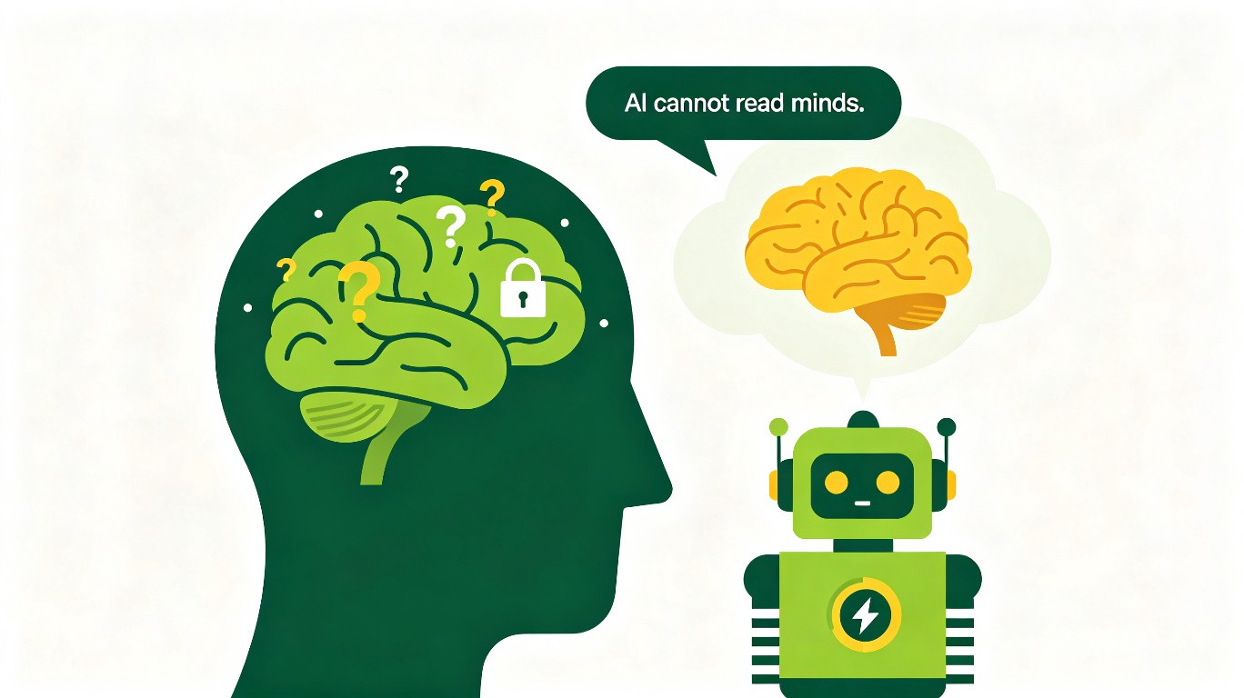
AI 不会读心。但你可以教会它——用最简单的语言告诉它你不懂,它就能用最简单的方式让你懂。